It’s been a long time coming. For those of you who have been following along, we received a publishing offer for our Gentelligence manuscript last fall. We had an April 1 deadline for the final manuscript submission. Just two weeks prior to the deadline, the world changed. The publisher furloughed all of their staff. We pushed through to the finish line, submitting the manuscript on time. There was no one in the publisher’s office to receive it.
It soon became clear that given the dramatic changes to the reality of work we needed to pull the manuscript back and revisit some of the chapters. Our chapter on building a Gentelligent People Strategy covered remote work as something our younger generations were hungry for, but something many organizations had not yet really embraced. That changed overnight, and so our discussion of it needed to as well.
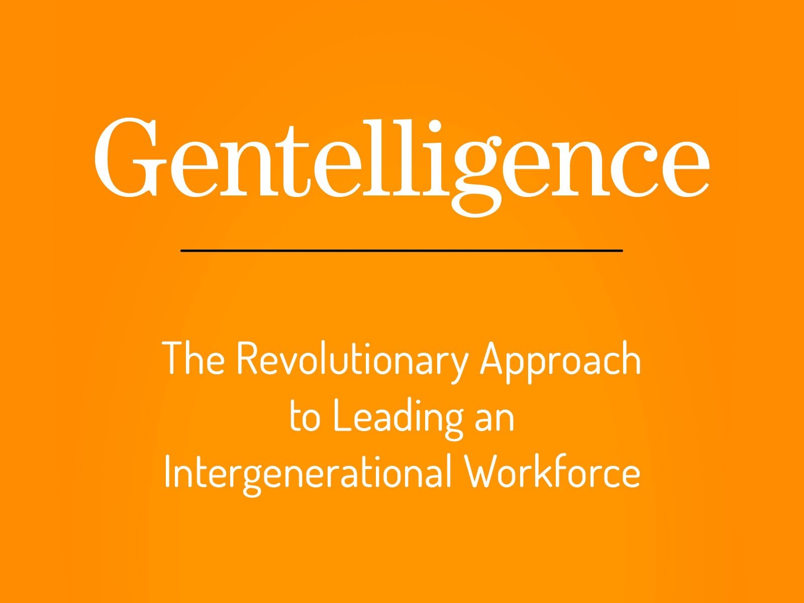
A Picture is Worth 70,000 words, apparently…
Fast forward through the summer, our publisher bringing their staff back to work (thankfully). The production process moved ahead. The past few weeks we’ve been in conversations about The Cover. We submitted inspiration images back in April–but those were but a dim memory for us by September. We looked at 3 cover proofs, but none was quite right. One of us liked the third image best, two of us leaned toward the second image, none seemed to check all the boxes. Gentelligence is a new word and an unfamiliar concept for a lot of people, so finding a way to communicate the concept graphically becomes even more important.
Over the last few months, as we’ve done more and more webinars on Gentelligence we’ve used a tug of war image to represent the struggle between generations in the workplace. Ultimately, we all agreed that image best captured what Gentelligence is really all about–that generational conflict is a tension that we largely create ourselves. It results in a win-lose scenario. Gentelligence pushes back on that dynamic, and if a picture is worth a thousand words, we wanted the right one.
Why Aren’t There More Purple Books?
I sent the covers and the images to my literary agent Jessica, who is very wise and knows things like What Makes a Good Cover. We all sent feedback to our editor, who sent feedback to the designer…and an entirely new design was produced the next day.
The image was closer, but debate raged on about the right color. What would make the cover stand out on your bookshelf? (Everything in my house and my wardrobe is either gray or black, so it’s safe to say my expertise lies in the area of generational leadership, not color theory). Purple made an appearance for a short time. I don’t own any purple business books (I checked)–is there a reason why people don’t publish purple books? What does purple say? Tan was on the table with one mockup. White and blue was another option. If I learned anything from the process, it was that people most definitely do judge books by their cover, so you really must get this right.
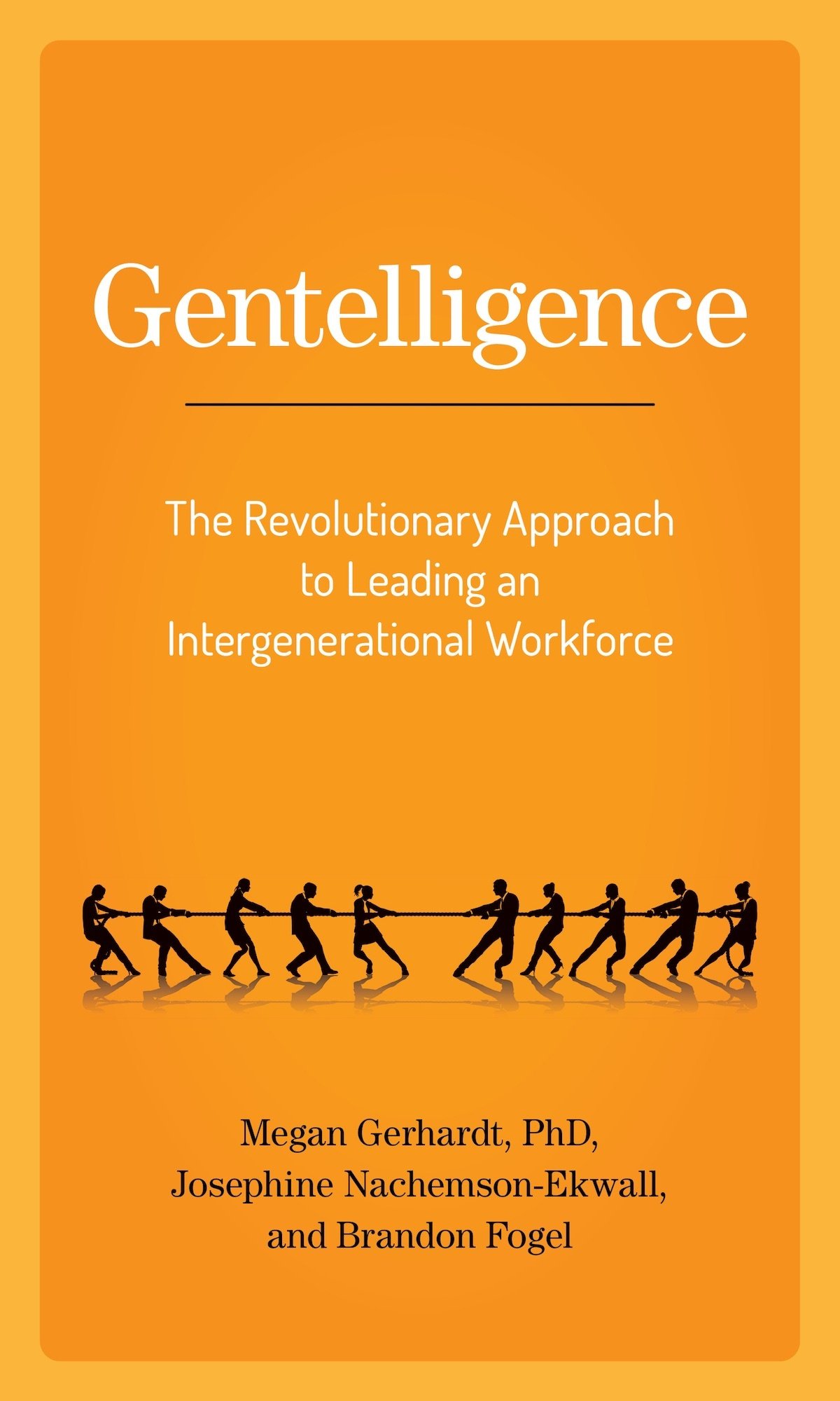
When this one appeared in my inbox, my gut said it was finally the right one. My co-authors and my agent all agreed–and we hope you do too! It’s surreal to see it. Here’s hoping you think Gentelligence is a title worth having on your own shelf (and just in case you want to be a trendsetter, here’s an early look at the Amazon pre-order link !


